


Creator: https://civitai.red/user/RKRRa
Ghibli Classic Look — Krea 2 Turbo
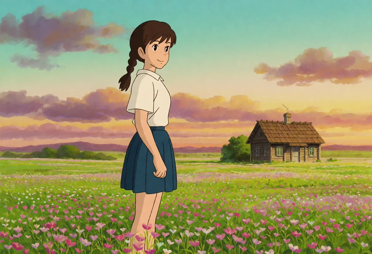
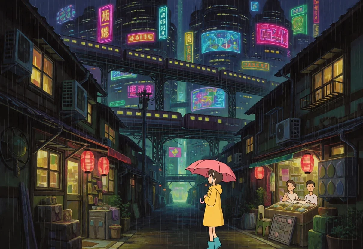
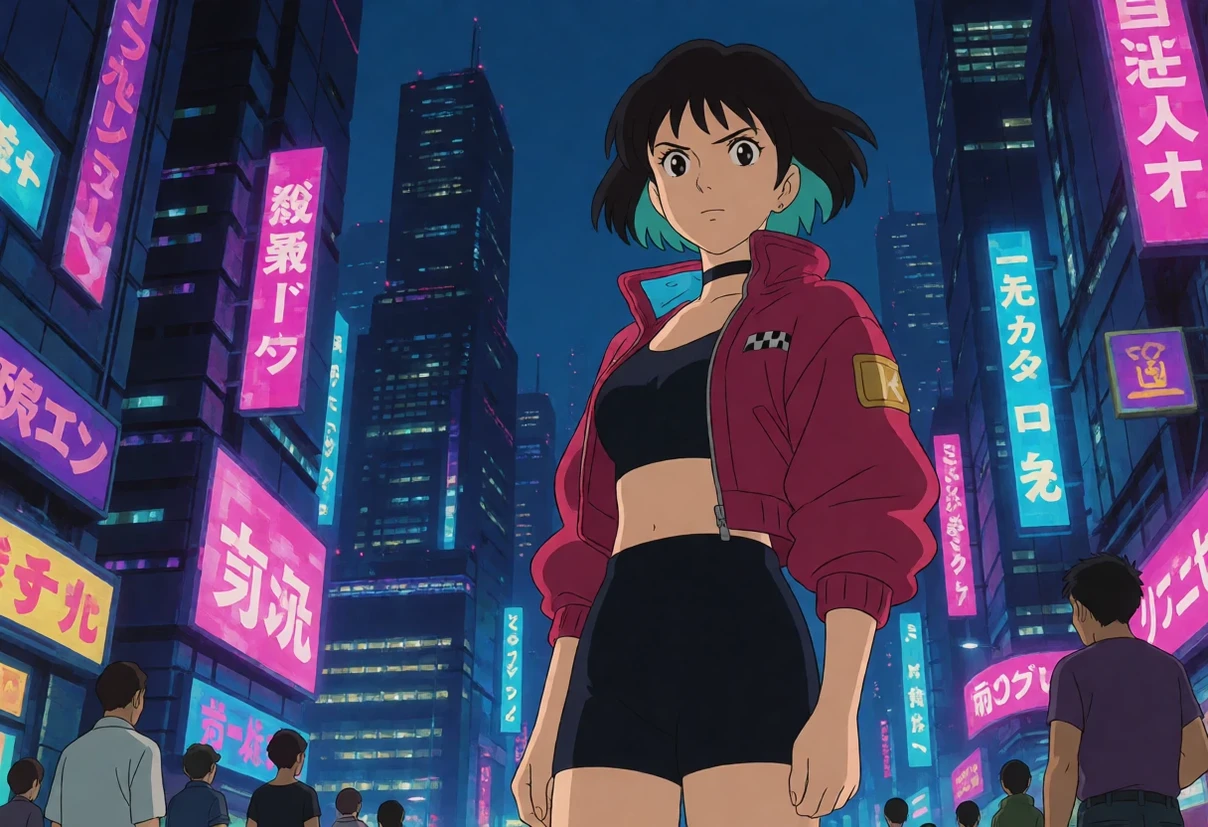
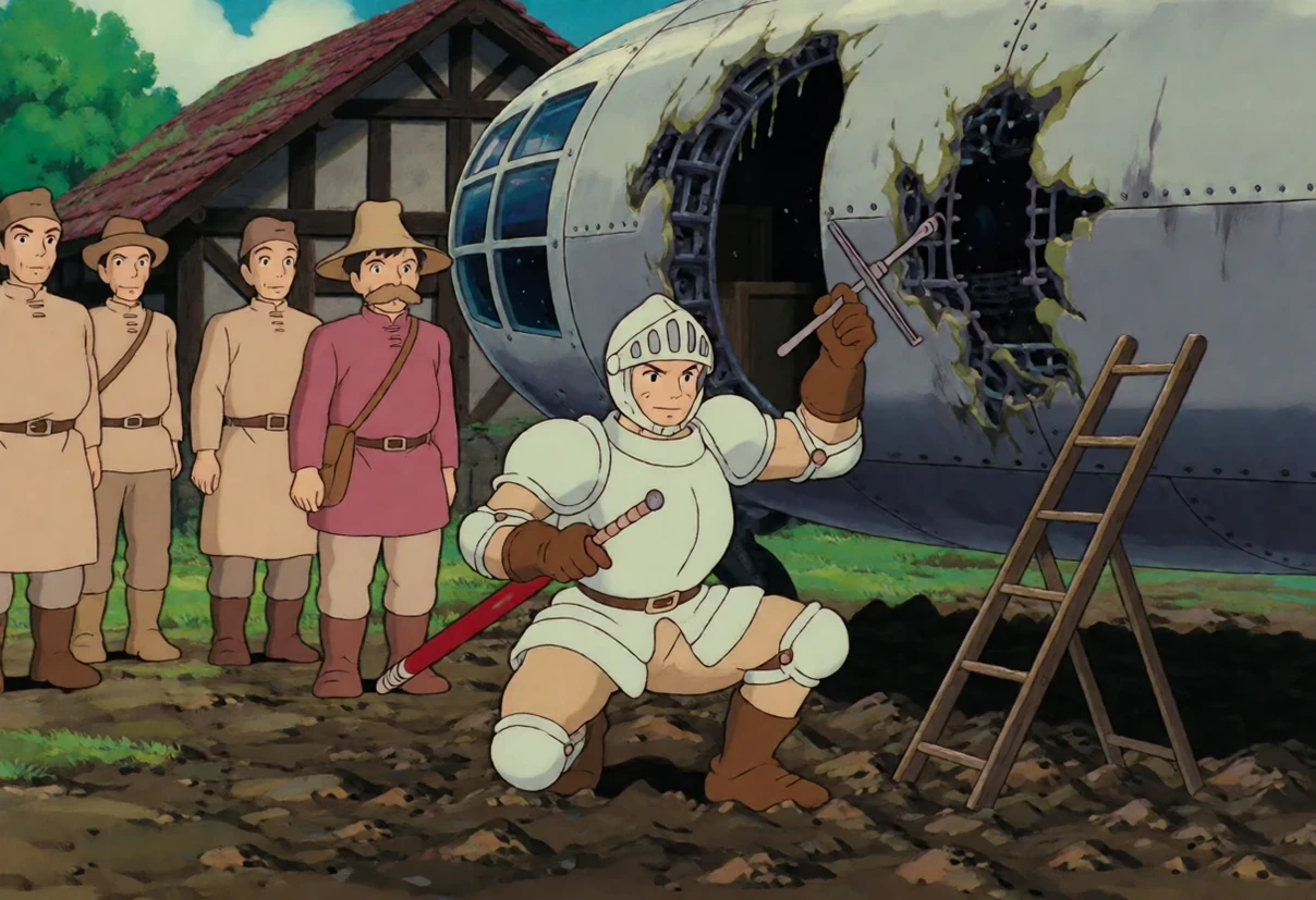
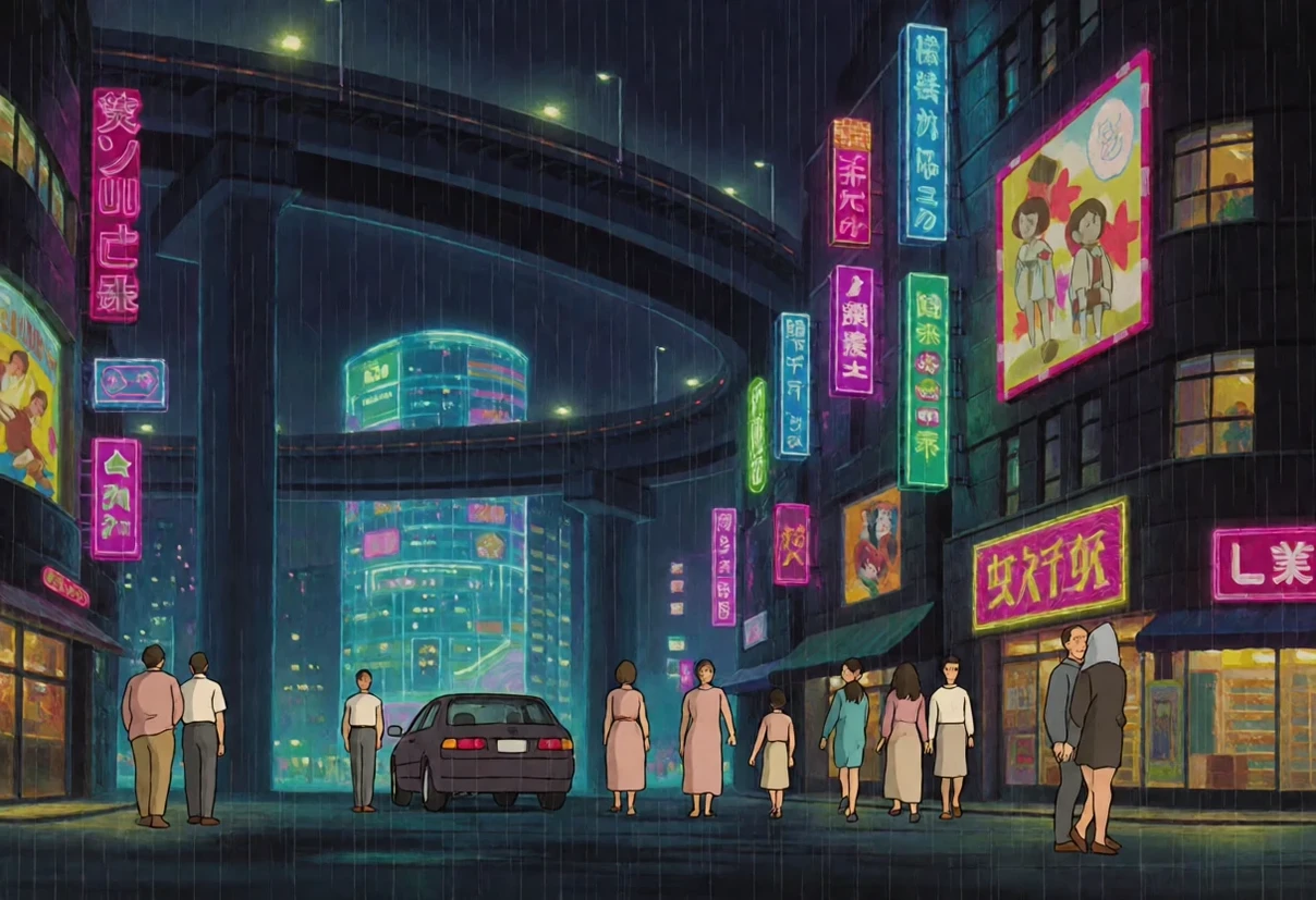
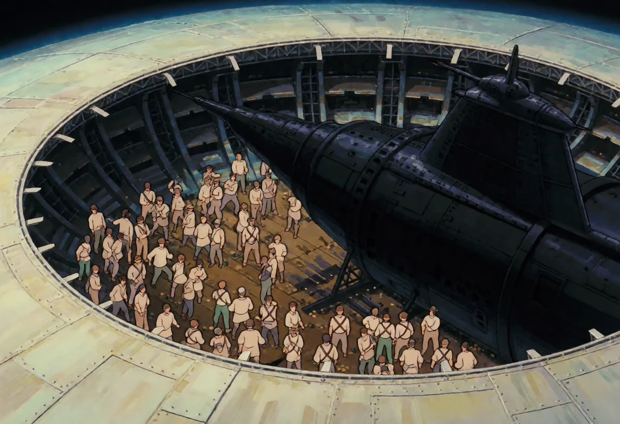
A Krea 2 Turbo checkpoint that paints in the classic Studio Ghibli look by default. No trigger word, no LoRA to load, nothing to dial in: the style is baked into the weights. Free.
Trained on over 1,500 frames drawn evenly from nine films that share the same visual treatment — Nausicaä of the Valley of the Wind , Castle in the Sky , Grave of the Fireflies , Whisper of the Heart , The Cat Returns , Tales from Earthsea , From Up on Poppy Hill , The Wind Rises and When Marnie Was There . Films with a different hand were deliberately left out — The Tale of the Princess Kaguya (watercolour), The Red Turtle (flat European line), Earwig and the Witch (3D) — so the look stays consistent instead of averaging into mush.
How to use it
Generate wide. This is the one thing that matters most. The training frames are 16:9 and the style is far stronger there: the same prompt with the same seed comes out fully drawn at 16:9 and photographic at 1:1 or 9:16. Use 1216×704 , 1344×768 or similar landscape sizes.
No trigger word. The style is always on. Describe the scene, not the style.
Settings: 8 steps, guidance 1.0, around 1 megapixel. It also runs on Krea 2 Raw at ~30 steps and guidance 3.5.
If a render comes out photographic
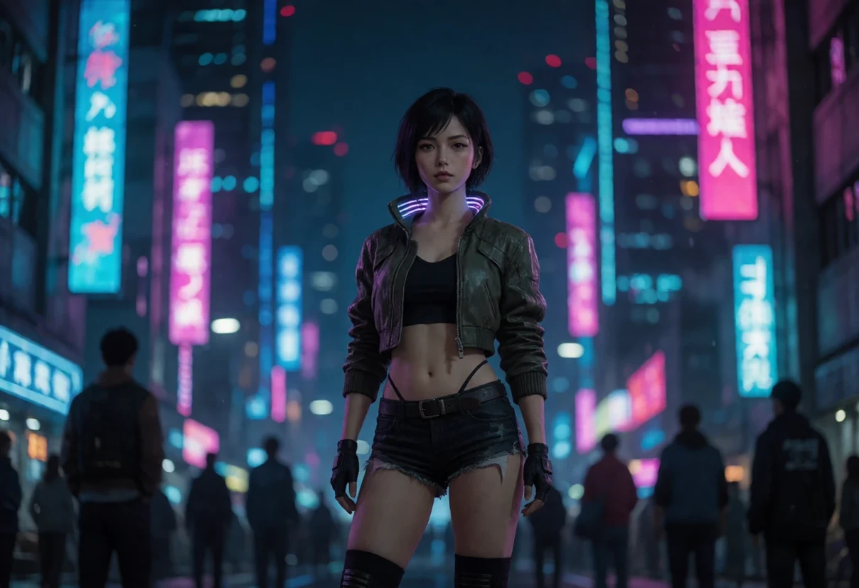
Some subjects pull hard toward photography — press events, corporate interiors, modern technical spaces, anything the base model has seen ten thousand photographs of. The fix is to name the medium at the front of the prompt. Any of these works, and none of them changes your scene:
-
anime illustration of … -
hand-drawn animation cel of … -
Studio Ghibli style, … -
or append
, hand-drawn, flat colours, painted background
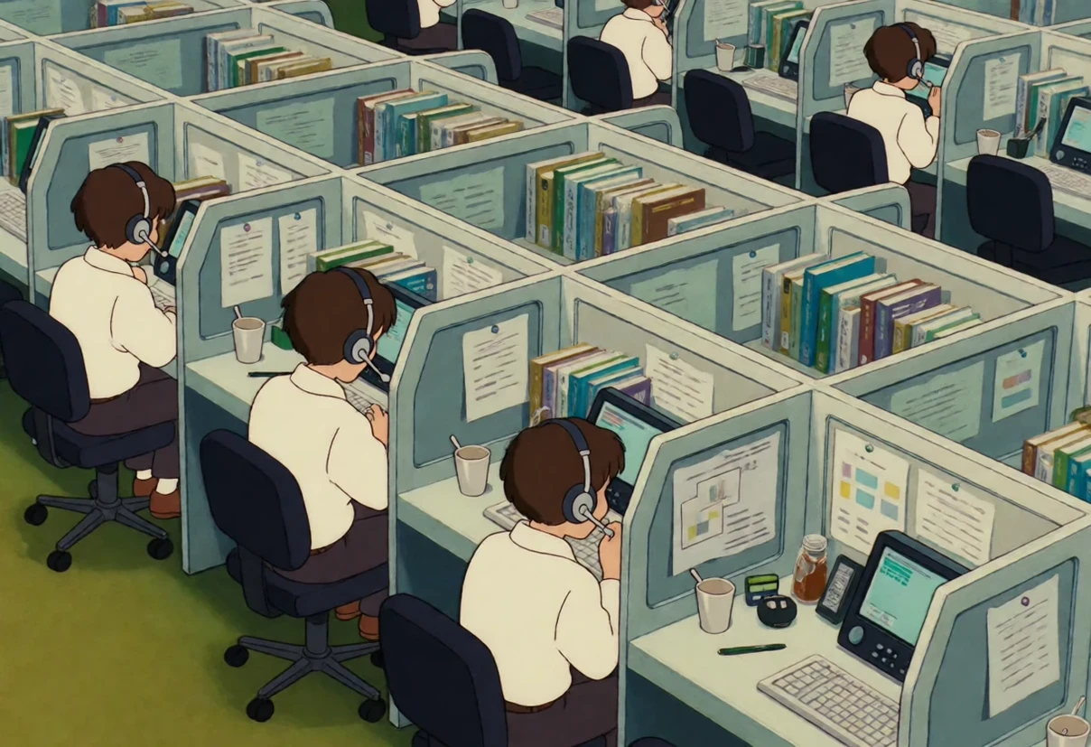
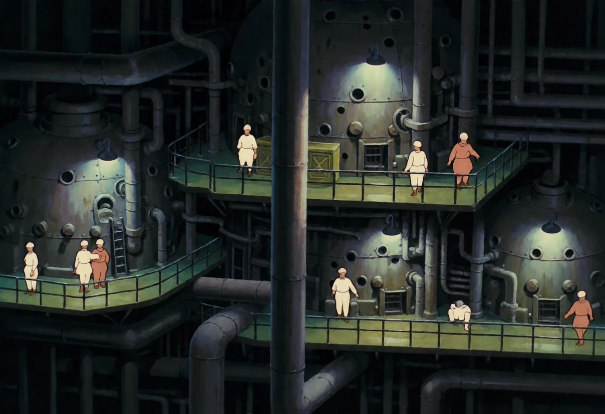
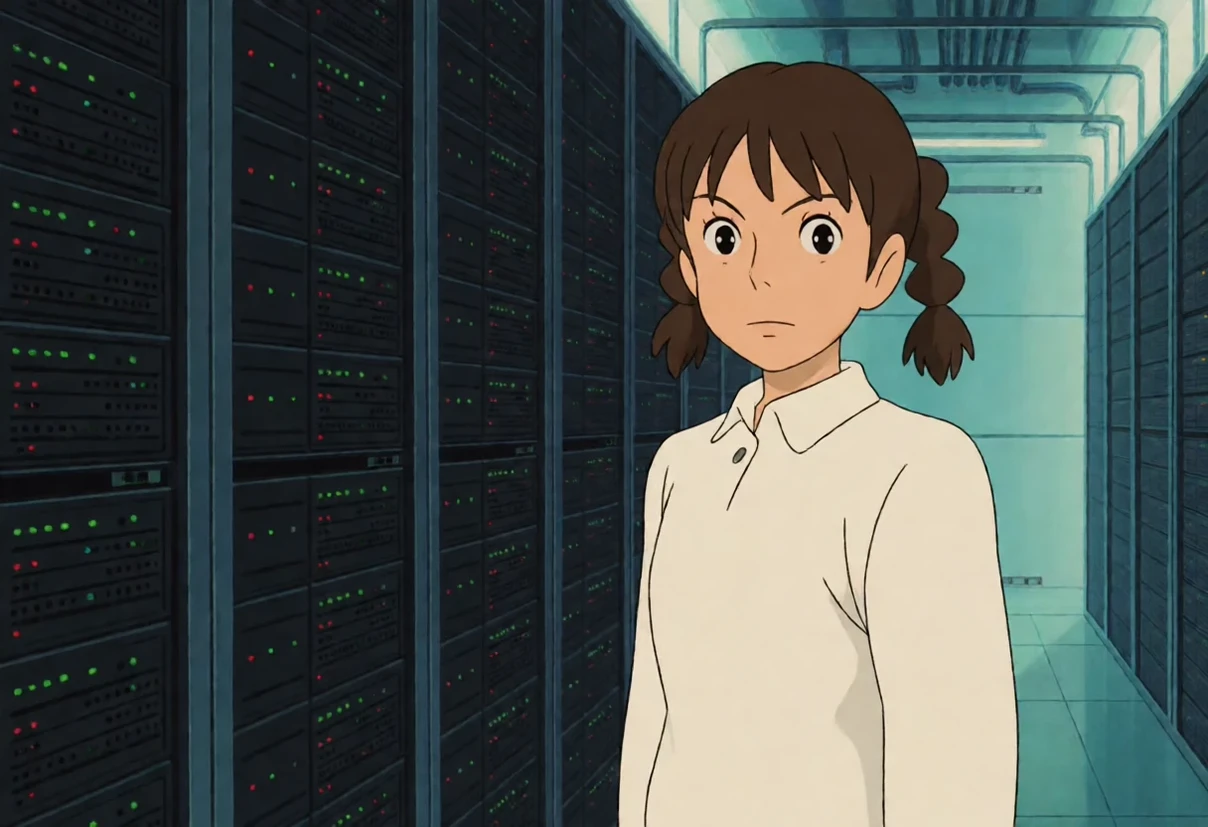
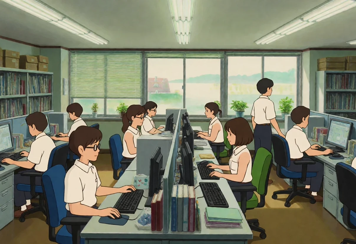
I tested this on the four subjects that resisted most — a call centre, a data centre hall, a car explosion and an operating theatre. All four came out drawn with any of those phrasings.
What overrides it, on purpose
-
Photography words.
photorealistic
,
85mm
,
f/1.4
,
press photograph
,
CCTV
,
Polaroid
— these win over the model every time. -
Naming another style.
Van Gogh
,
ukiyo-e
,
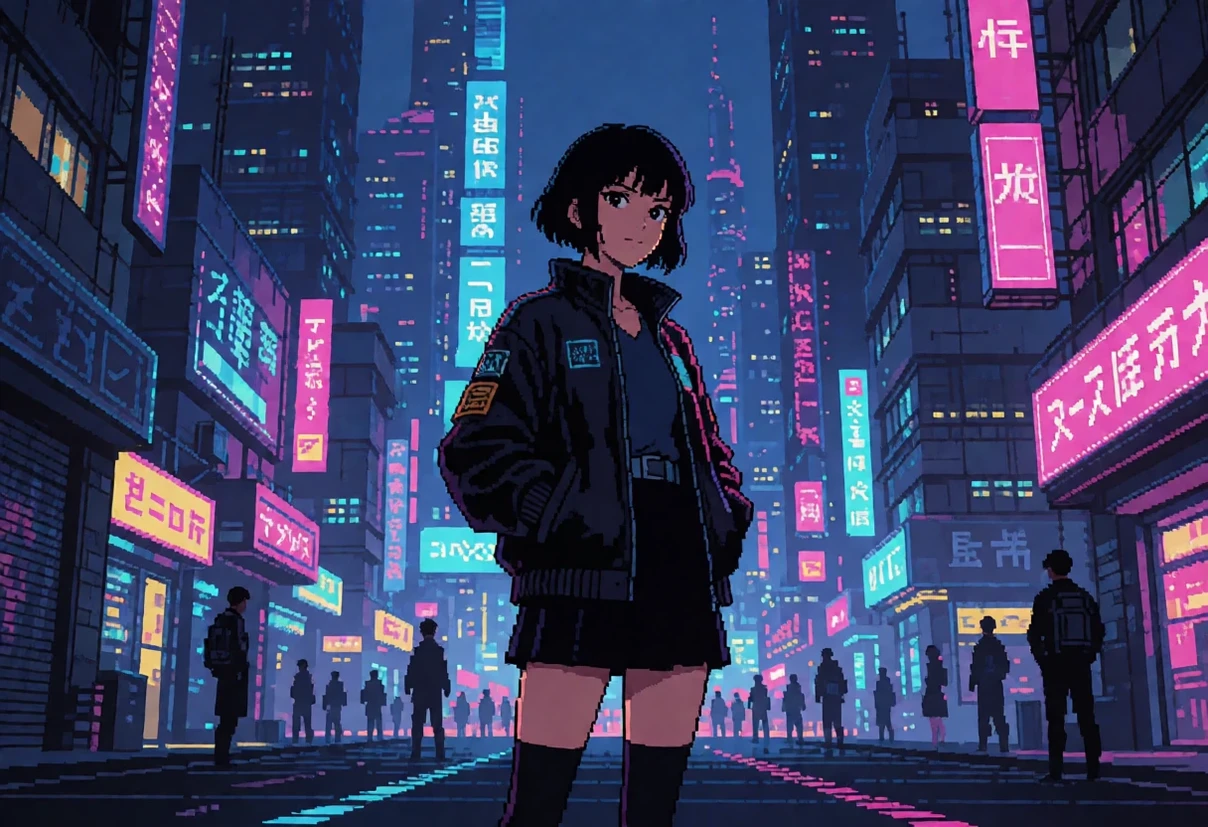
pixel art
,
American comic book
— you get that style instead.
This is deliberate. A model that ignores your prompt is not a better model; it is a model you cannot steer.
Prompt examples
All of these were rendered at 16:9, 8 steps, guidance 1.0:
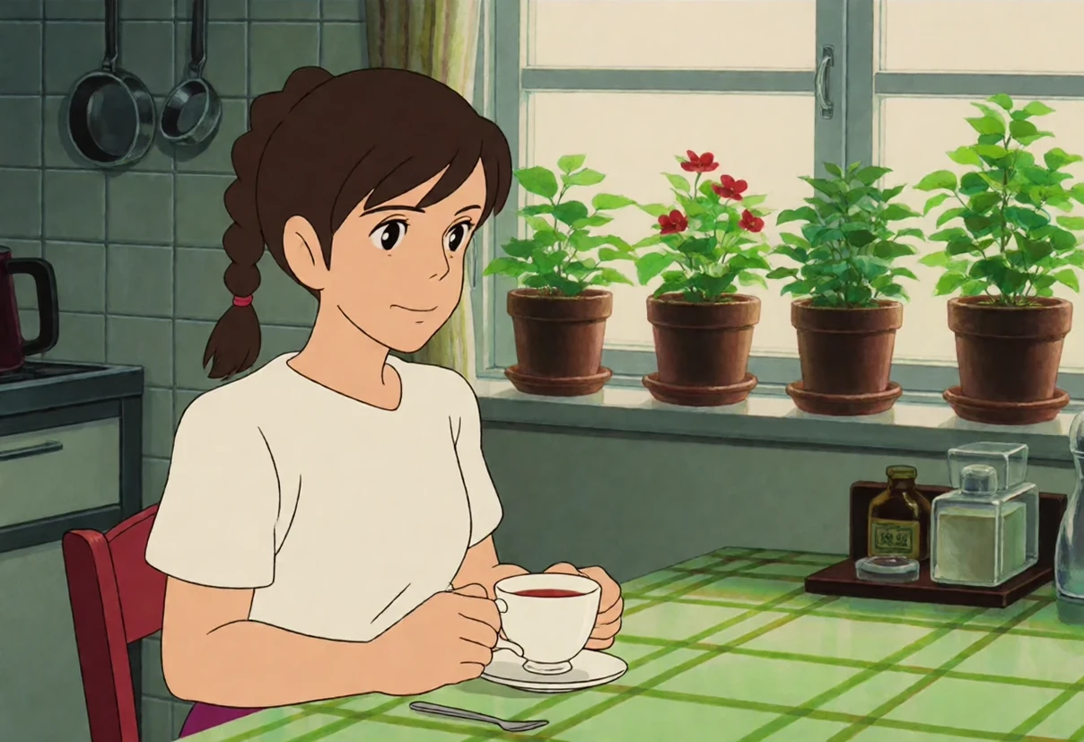
"a woman in her thirties sitting at a kitchen table with a cup of tea, morning light through the window, potted plants on the sill"
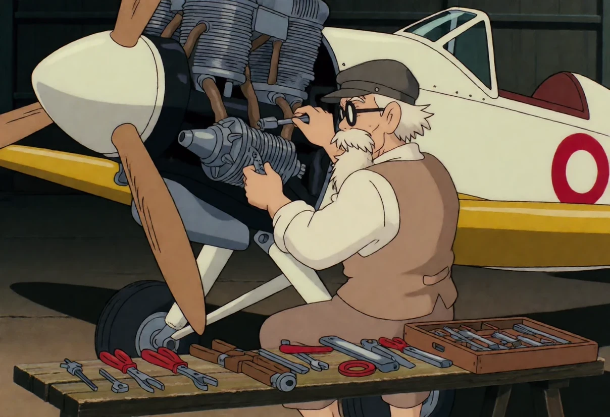
"an old man repairing a small propeller aircraft engine inside a hangar, tools laid out on a bench"
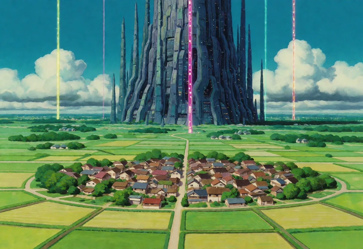
"a wide green valley with a winding road and telegraph poles, tall cumulus clouds, summer afternoon"
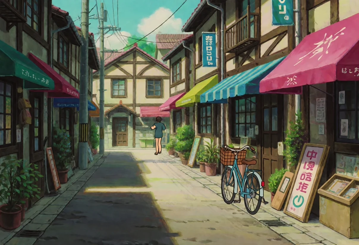
"a narrow city street with small shops, bicycles and cloth awnings, late afternoon light"
"a cat asleep on a windowsill next to potted plants, warm afternoon light"
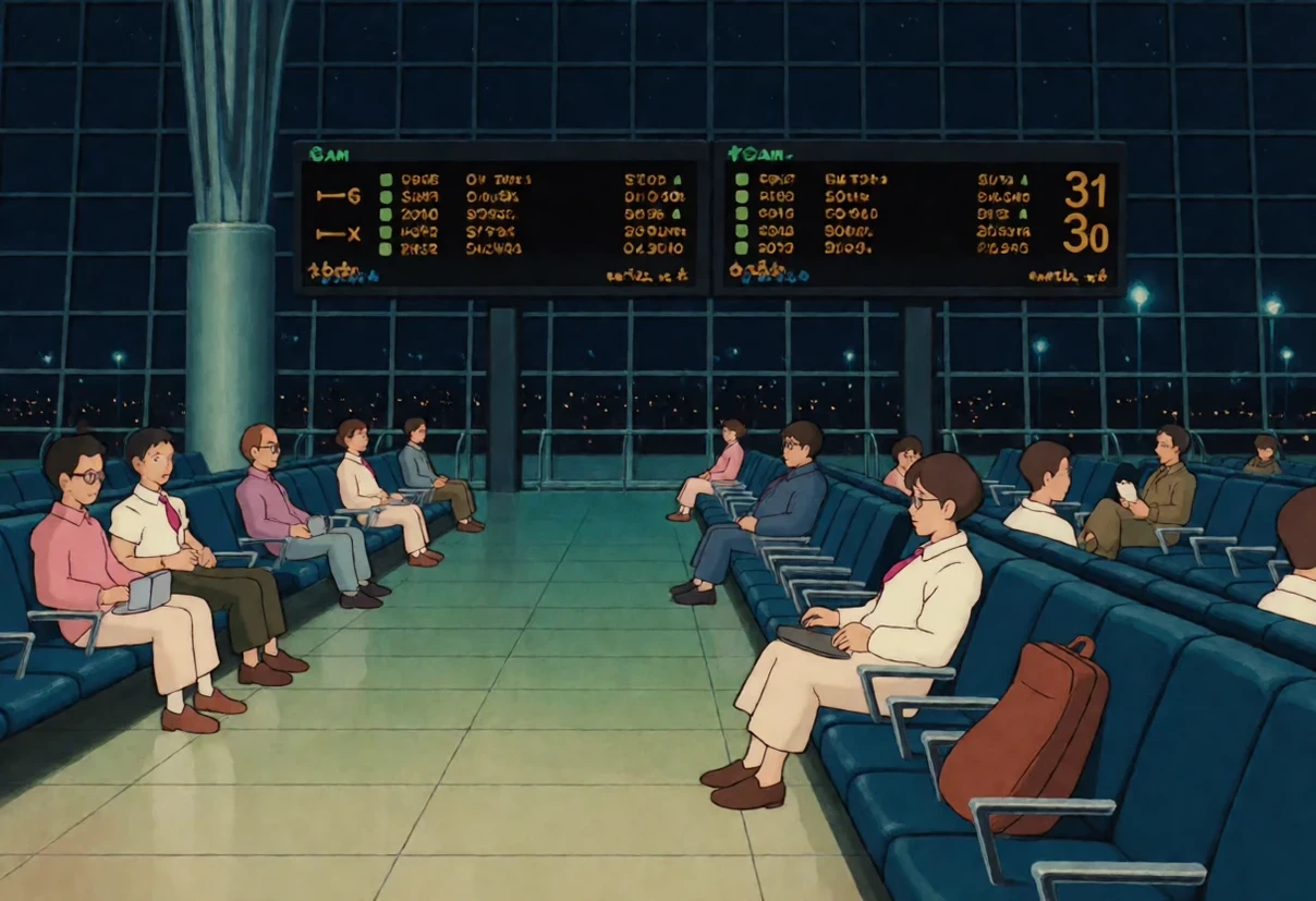
"an airport terminal at 3am, empty gates and departure boards"
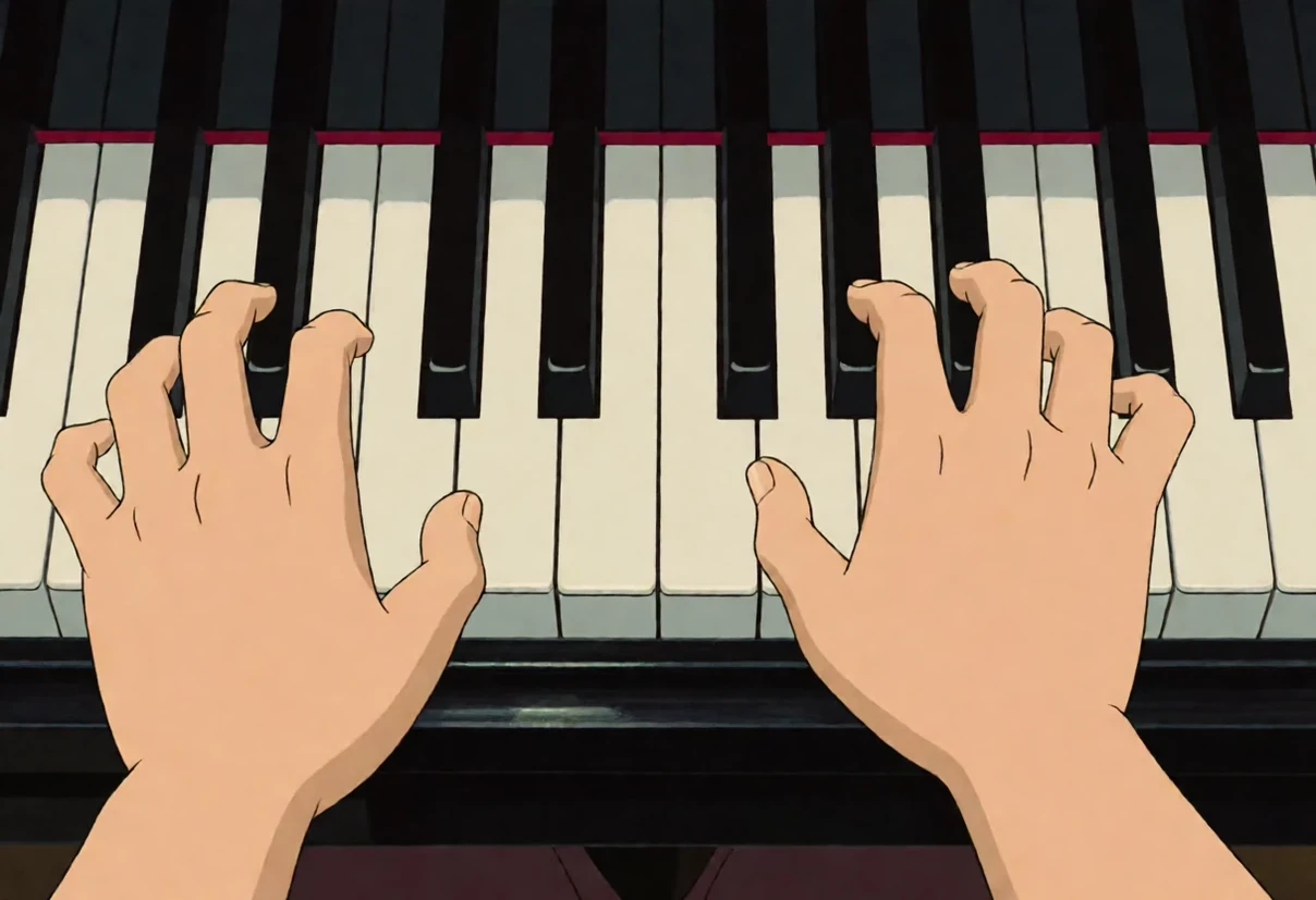
"close-up of two hands playing a grand piano, all ten fingers visible"
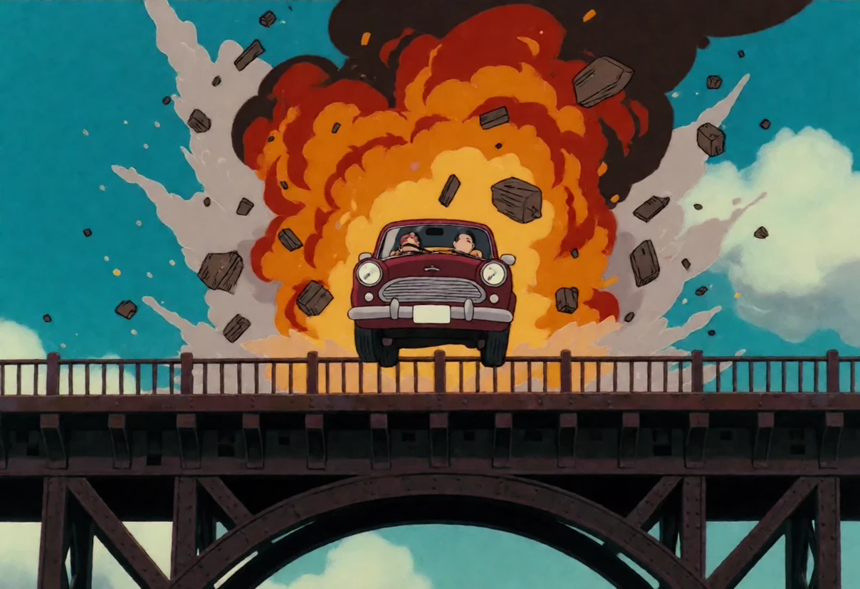
"a car exploding on a bridge, debris frozen mid-air"
"hand-drawn animation cel of an operating theatre mid-surgery, surgical lamps and monitors"
"anime illustration of a call centre floor with rows of identical cubicles and headsets"
The last two show the trick above: both of those subjects come out photographic without the leading phrase, and fully drawn with it.