


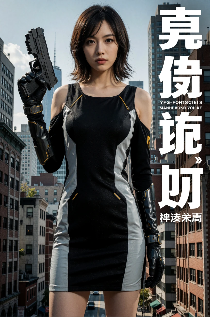
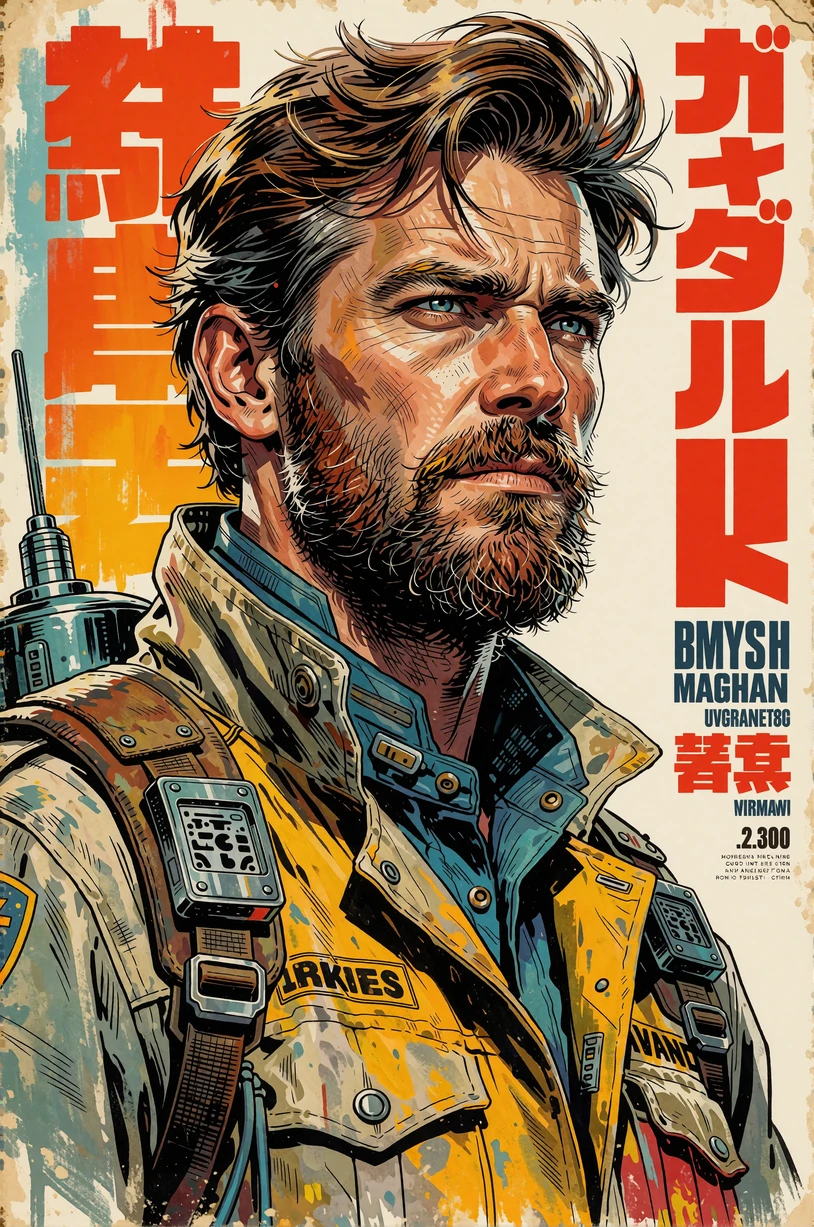
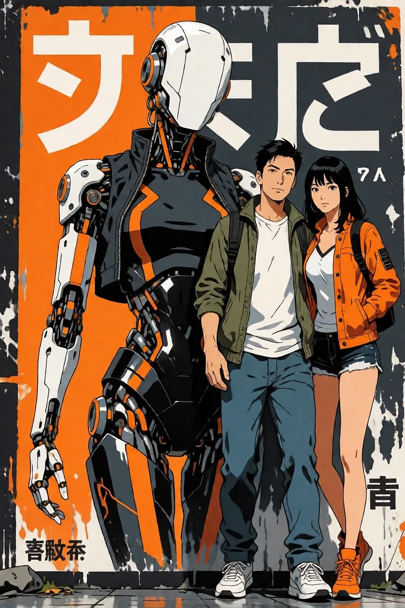
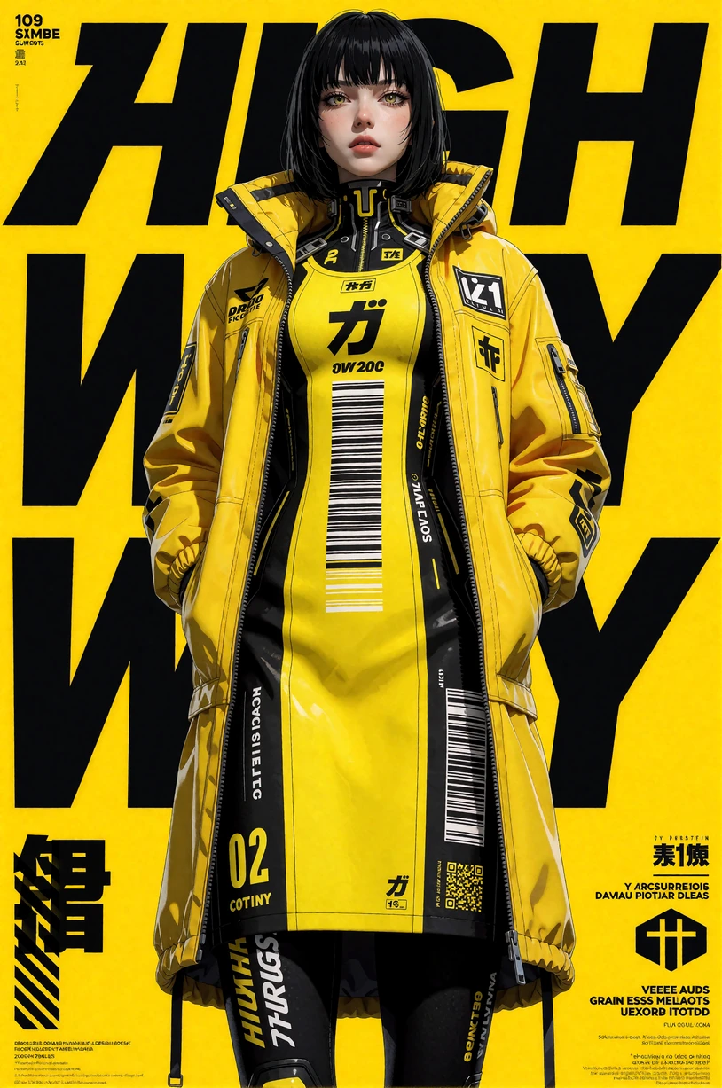
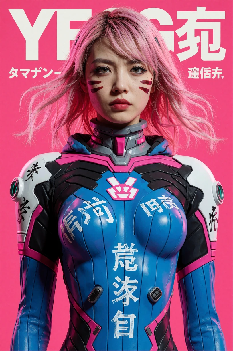
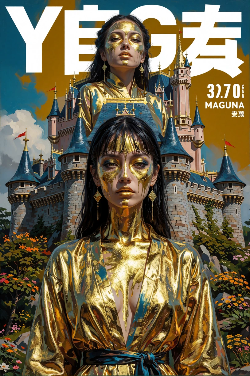
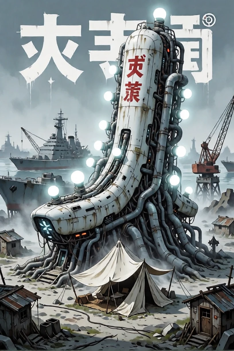
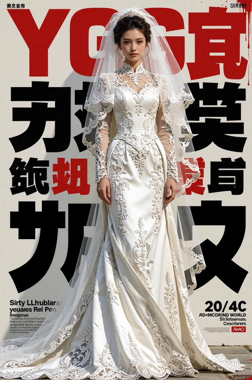

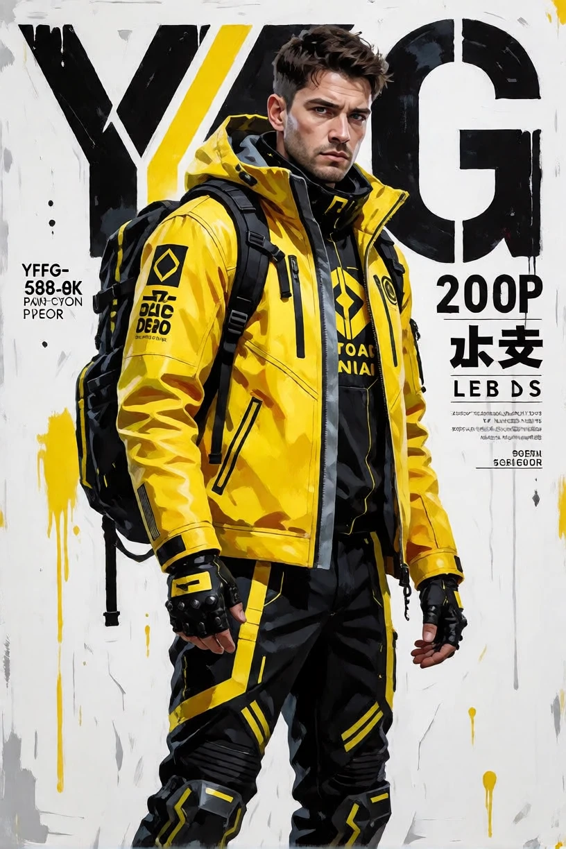
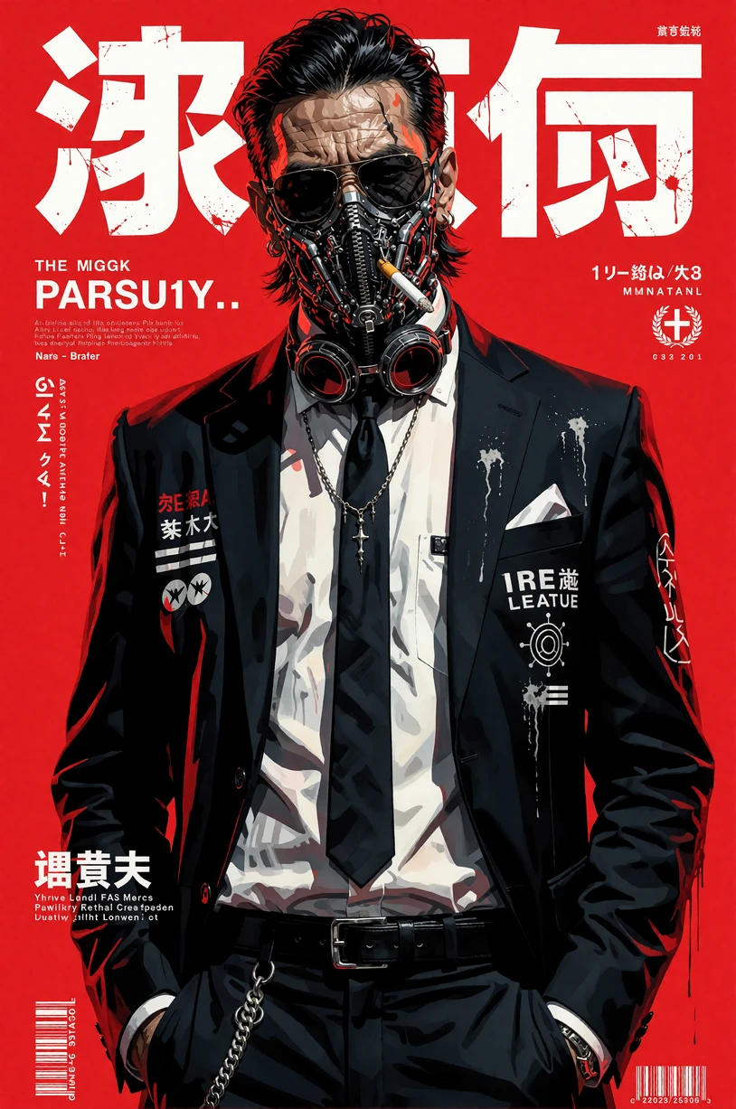
( Not my Model )
YFG Fonts – Japanese Manga Poster Style
Style
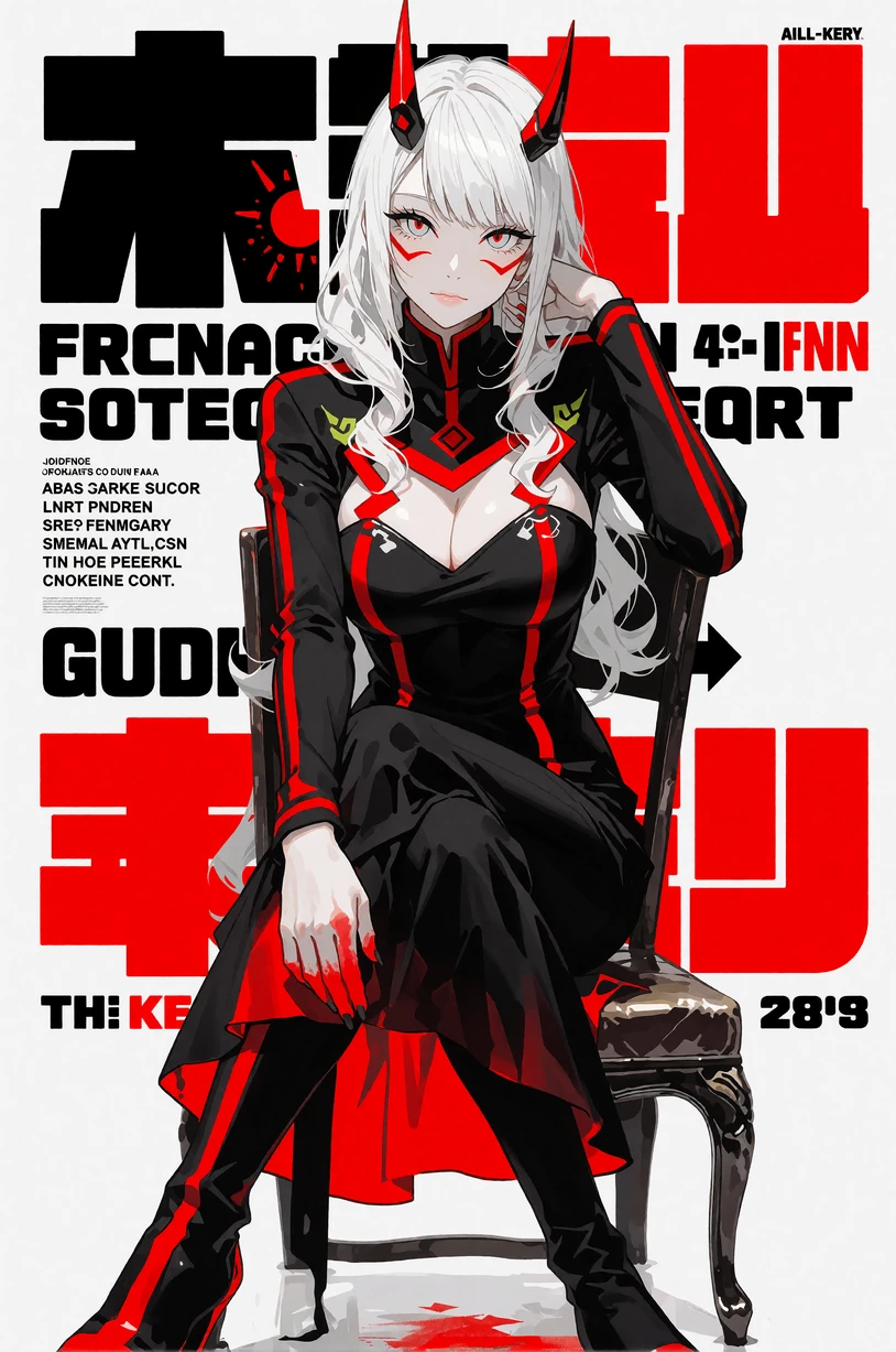
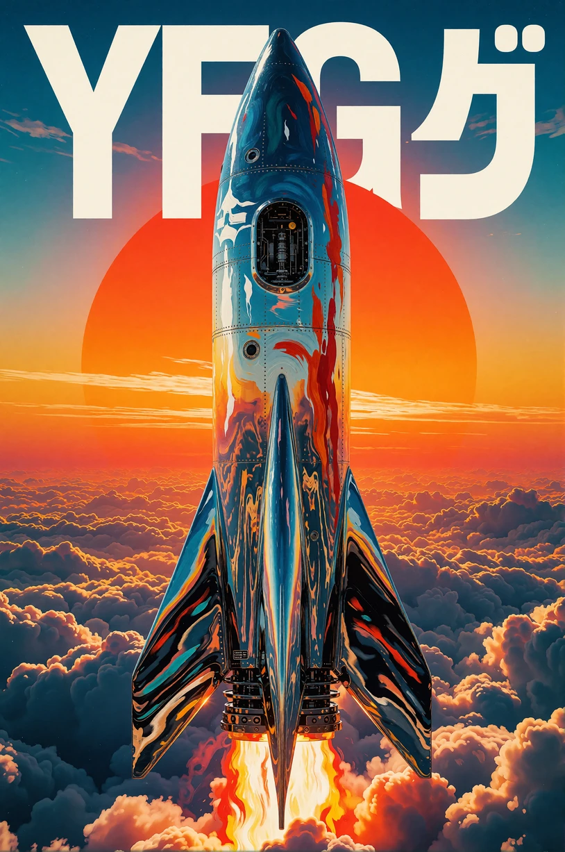
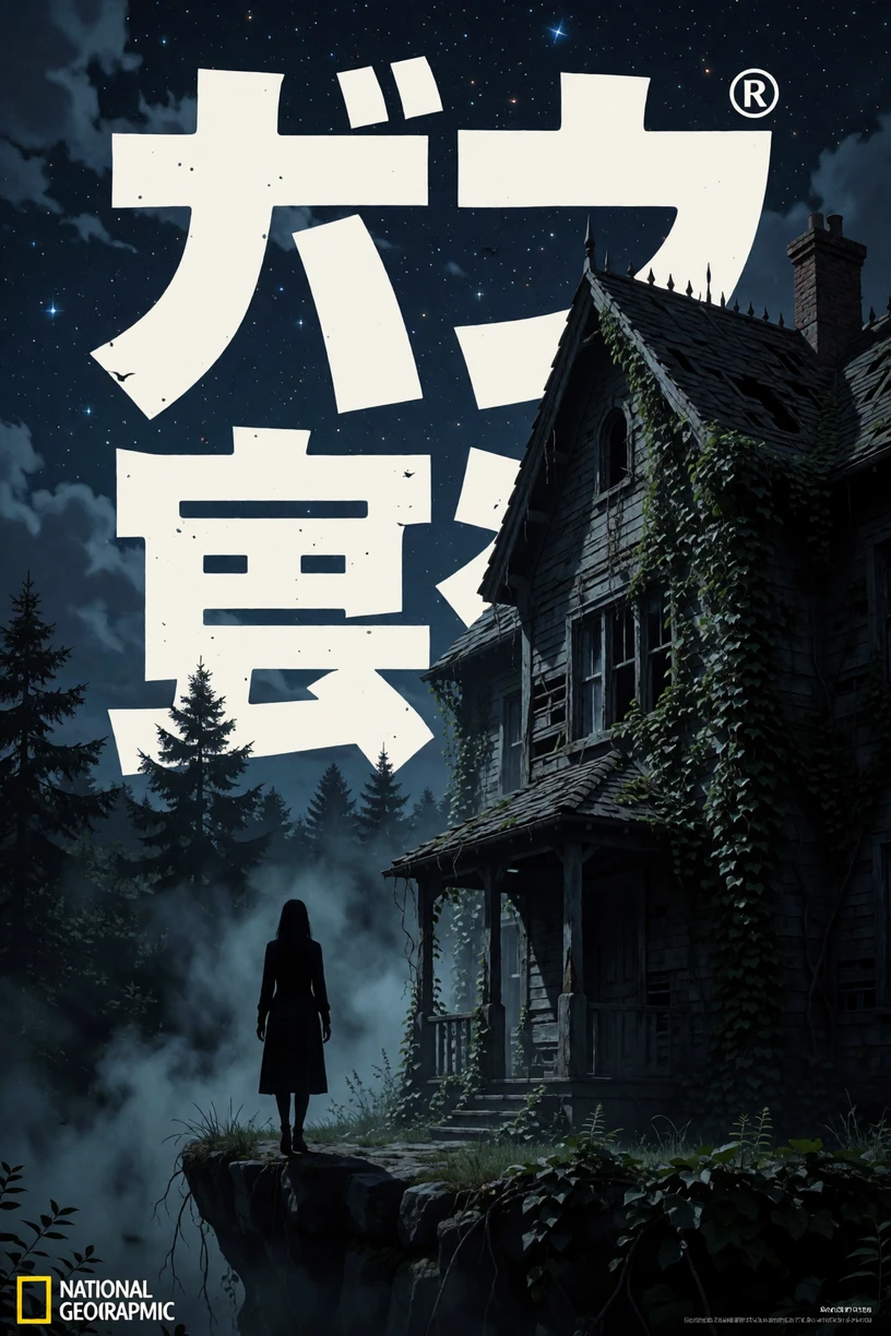
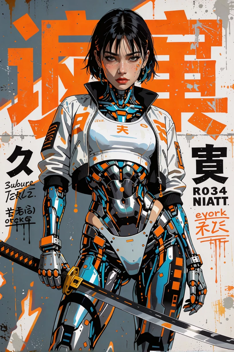
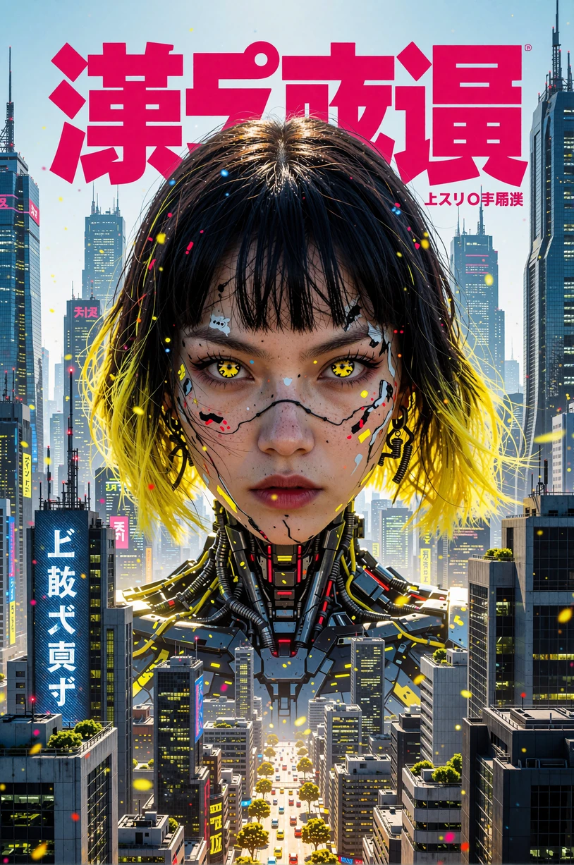
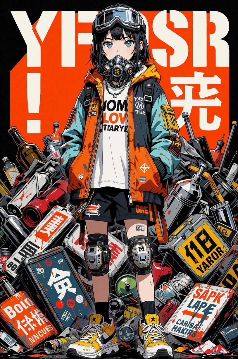
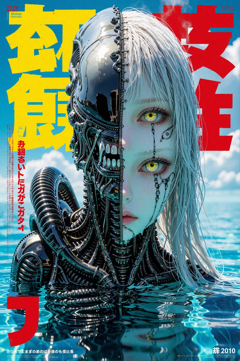
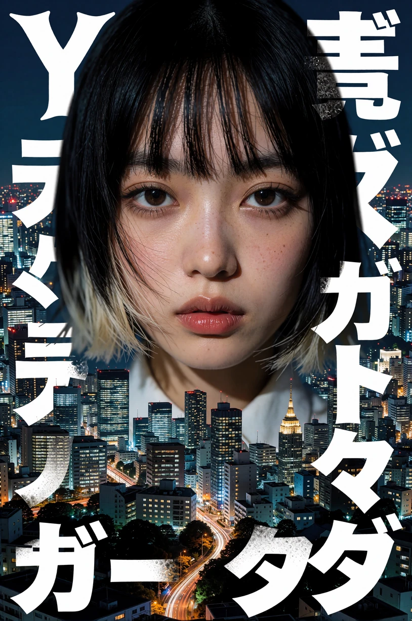
Applies bold, graphic manga‑inspired poster aesthetics to any prompt: oversized type, high‑contrast blocks, screentone textures, and attention‑grabbing layouts reminiscent of vintage shōnen magazine covers.
Trigger
No single trigger word. Guide the model with phrases such as:
-
“Japanese manga style poster”
-
“Poster, large fonts, graphic”
-
“Large fonts poster”
-
“Japanese manga style poster with bold large fonts and graphics”
Combine or tweak these phrases to maximize the manga‑poster feel.
Strength
Works from
0.15
(subtle graphic flair) to
1.10
(over‑the‑top ink explosions).
Sweet spot:
0.40 – 0.80
for crisp type, bold panels, and balanced illustration.
Key Characteristics
-
Oversized Typography – Dynamic kanji/romaji lettering, angled captions, and headline‑style fonts.
-
Graphic Panels & Screentones – Blocks, halftone dots, speed lines, and comic onomatopoeia.
-
High Contrast Colors – Flat reds, blacks, whites, or limited bright palettes that pop off the page.
-
Versatile Subjects – Adds poster flair to characters, vehicles, objects, or landscapes—everything becomes a manga cover.
Prompt Ideas
-
“Japanese manga style poster of a futuristic samurai, bold large fonts and graphic panels.”
-
“Poster, large fonts, graphic, featuring a cyberpunk motorcycle race, speed lines everywhere.”
-
“Manga cover with heroic team pose, oversized title text, limited red‑black palette.”
Tips & Tricks
-
Specify Font & Layout
-
Use “angry brush kanji,” “bold condensed headline,” “angled type,” or “panel grid layout” to shape the design.
-
-
Control Color Range
-
For classic shōnen vibes: “red, black, white.”
-
For retro pastel: “mint green, peach, cream.”
-
-
Halftone & Screentone
-
Add “heavy screentone,” “halftone texture,” “comic dots” for authentic print feel.
-
-
Strength Tuning
-
If the fonts overshadow your subject, dial LoRA strength down or add “keep main character clear” in the prompt.
-
-
Blend With Other LoRAs
-
Combine with character or environment LoRAs; keep YFG Fonts at ~0.5 to ensure poster elements complement rather than dominate.
-
Turn any concept into a high‑impact manga cover or theatrical graphic sheet with YFG Fonts – Japanese Manga Poster Style . Adjust strength and prompt wording to strike the perfect balance between explosive type, comic textures, and your scene’s core imagery.